
Introduction
This paper, produced as part of the LGA’s ‘Work Local’ programme, and presents supplementary analysis of differences between local labour markets in England. The analysis uses the Annual Population Survey alongside real-time vacancy data supplied for this project by Adzuna, one of the largest jobsearch engines in the UK, to categorise areas according to their levels of labour force participation[1] and vacancies[2]; with areas then compared on a range of measures.
The analysis in this report is presented in three parts as follows:
- The first section, below, sets out the approach taken in categorising areas according to their levels of labour force participation and vacancies, alongside the results from that analysis.
- This is then followed by analysis of unemployment and vacancies by areas, to give an indication of how labour market tightness and slack varies between places.
- The subsequent section then presents further analysis of areas on a range of measures including historic employment growth, earnings, skill levels, job types and future prospects.
The report then draws together some key conclusions from this analysis.
Mapping participation and vacancy rates
Context
We entered the COVID-19 pandemic with among the highest rates of inequality in the developed world; and with significant variation in labour market participation, earnings and incomes between places and groups. The pandemic caused a significant economic shock across areas, but initial fears of an unemployment crisis have now given way to concerns around significant falls in labour force participation alongside recruitment challenges as firms struggle to fill record levels of vacancies.
However these ‘new’ crises – of participation and recruitment – are inevitably being felt differently in different areas, given places’ differing economies, labour markets, demography and histories. There are also already signs that the pandemic and recovery is accelerating broader structural changes in the labour market which could in turn exacerbate inequalities without further action. This means that the UK’s highly centralised (but at the same time, often fragmented) employment and skills system is unlikely to be able to meet the challenges and make the most of the opportunities that we will face in the coming decade.
Understanding differences between areas
One way to illustrate these differences between places is to look at the twin challenges of participation and recruitment together at local level, in terms of places:
- Economic activity rates, which measure the proportion of the population who are either in work or actively seeking work (with the remainder being those who are not seeking and/ or available for work, and so economically ‘inactive)
- Vacancy rates, which measure the number of job vacancies per one hundred people of working age.
By grouping places on these two dimensions, we can think about areas as being in one of four broad categories as set out below.
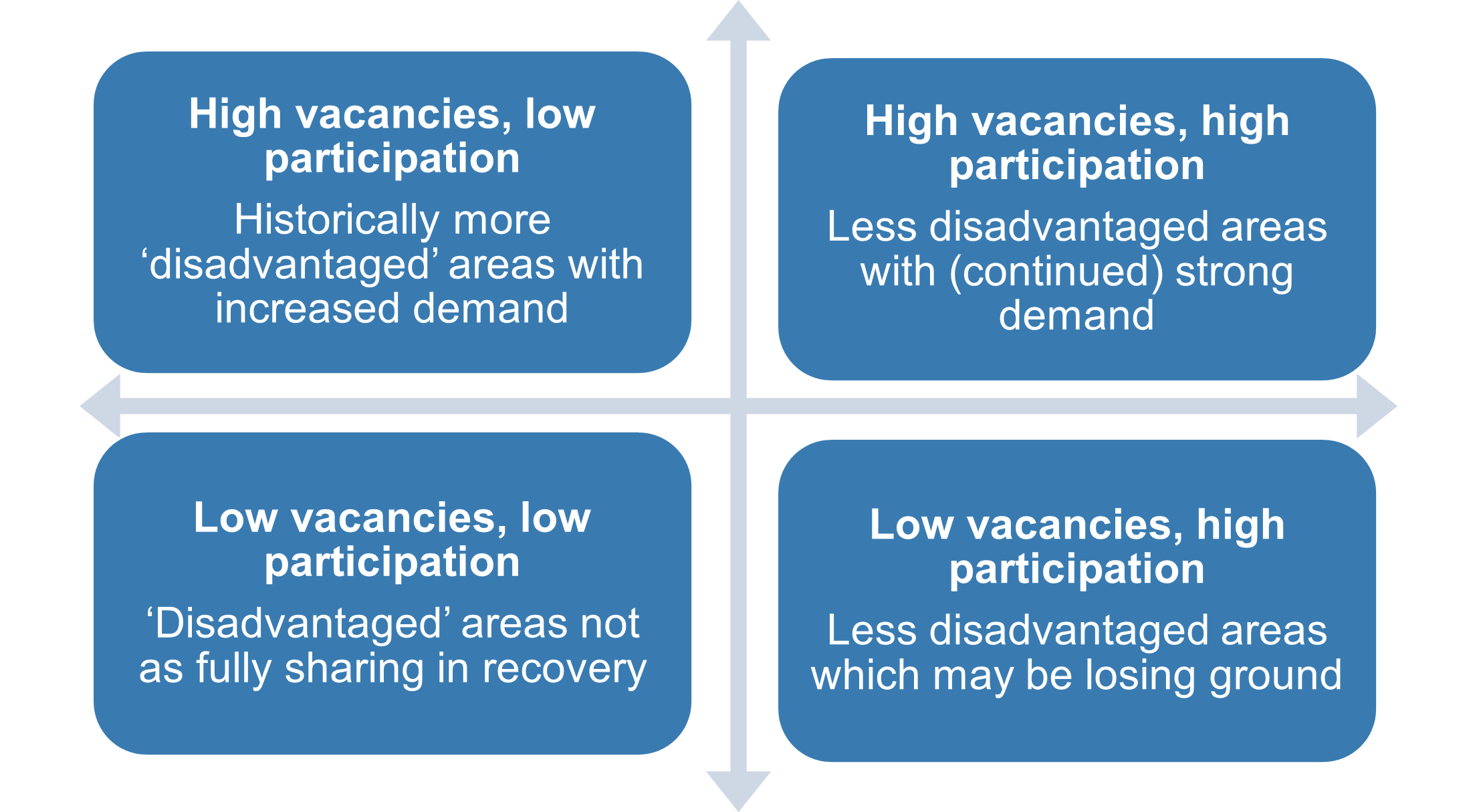
Source: Institute for Employment Studies
In order to then map local areas on these dimensions, we have used Annual Population Survey data on economic activity alongside online vacancy data supplied by Adzuna. We have done this for all 308 English local authorities (excluding the Isles of Scilly, which have been excluded due to some datasets not including separate data on this local authority area), placing areas into one of five categories: the four groups set out above, pus a ‘Middle group’ of areas that are close to the national average on both participation and vacancy rates.
Results
The results of this analysis are set out below, first in a scatter graph showing standardised vacancy rates (on a log scale) and participation rates by local authority area; and then in a map using the same colour coding.
Figure 2: Local authority vacancy and economic activity rates (standardised). Source: IES analysis of Annual Population Survey and Adzuna data

Figure 3: Mapping labour market participation and vacancies by area. Source: IES analysis of Annual Population Survey and Adzuna data.
This analysis illustrates clearly the diversity of experiences and impacts between places, with no one region faring the same and areas with very different rates of participation and vacancies cheek by jowl.
However the colour-coded map in particular illustrates some common themes and patterns, with:
- coastal and some ex-industrial areas in particular experiencing both low participation and relatively fewer vacancies, and so potentially struggling to narrow gaps with other areas (red)
- the southern half of the country, often less urban areas, more likely to have higher participation and high vacancies, so well placed to build on their pre-crisis strengths (green)
- many parts of London and the South East seeing high participation but also relatively low vacancies, reflecting the significant impacts of the crisis on London and its wider economic footprint in particular (orange)
- parts of the Midlands and North West in particular experiencing strong growth in vacancies but with relatively low rates of economic activity (purple)
- areas that are close to the national average in terms of participation and vacancy rate are fairly evenly spread across England’s regions (blue).
These different impacts can also be seen more clearly by analysing the five categories set out above against the area classifications produced by the Office for National Statistics. These classifications group together areas that are statistically similar into eight broad ‘supergroups’. This analysis is set out below, and illustrates that:
- areas with both low participation and low vacancies are predominantly in ex-industrial areas and some ethnically diverse cities
- areas with higher participation and vacancies are predominantly in more affluent parts of the country
- those with low participation but high vacancies are across a range of groups but most commonly in major cities outside of London (including Birmingham, Bristol, Coventry, Leicester, Liverpool, Manchester, Oxford and Sheffield), as well as the City of Westminster
- those with high participation but weaker vacancies are found particularly in London and in smaller towns.
Importantly however, this analysis also shows that virtually without exception, all five area types are represented across all eight of the broad classifications. So just as a ‘one size fits all’ approach cannot be expected to meet these diverse needs, a ‘five size fits all’ model is unlikely to fare any better. Separate case studies collated from local areas for the Work Local programme illustrate this clearly. For example:
- in the county of Essex, there are local areas in each of the five groups – with the county playing a key role in co-ordinating activity across boroughs to share prosperity and support residents in all areas to access good work
- in West Yorkshire Combined Authority there is a similar diversity, with boroughs with relatively low participation and weak demand neighbouring areas with strong growth and high vacancies – and the Mayoral Authority work to ensure that skills, transport and employer policy is aligned to support local growth.
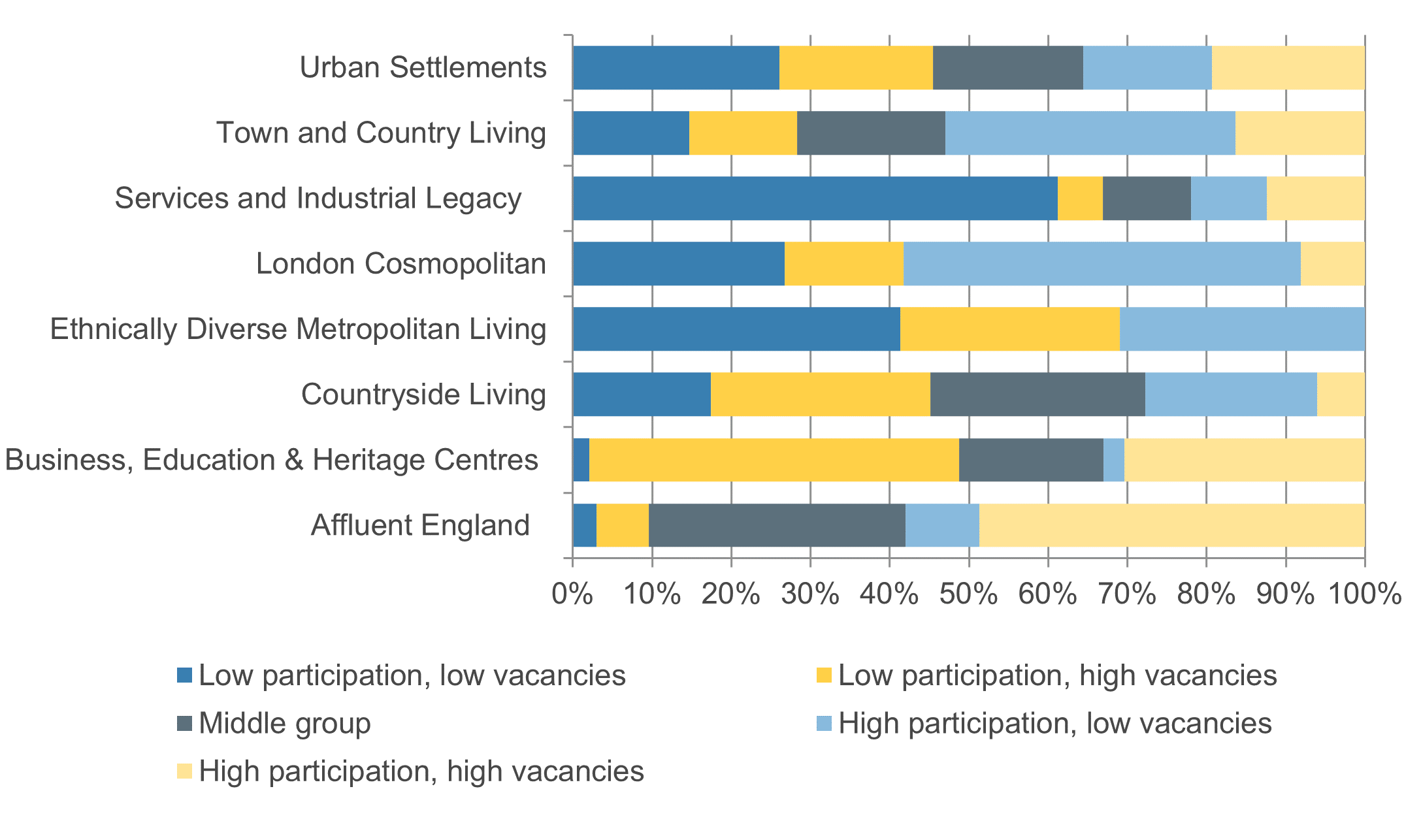
Source: IES analysis of Annual Population Survey, Adzuna and ONS Area Classification data
Unemployment and vacancies by area
Variations in labour market tightness and slack
The headline story in the labour market in the last six months has been of falling unemployment combining with record vacancy levels leading to an increasingly ‘tight’ labour market. A key measure of labour market tightness is the number of unemployed people per vacancy (known as the unemployment to vacancy ratio). This has fallen overall from four unemployed per vacancy in the depths of the crisis to barely one on the most recent data (i.e. there are now nearly as many vacancies as there are unemployed people). This is the lowest ratio in at least fifty years, and well below pre-crisis levels (of around 1.6).
However underneath this national average, we find that the broad differences between areas set out in the section above are also reflected in local competition for jobs, with often wide variation between areas. In order to estimate local unemployment:vacancy ratios, we have used Adzuna vacancy data alongside a modelled estimate of the local unemployment rate[3]. This finds that:
- in two fifths of areas (42 per cent) there is fewer than one unemployed person per vacancy – i.e. more vacancies than there are unemployed
- in one third (30 per cent) there are more than twice as many unemployed as there are vacancies.
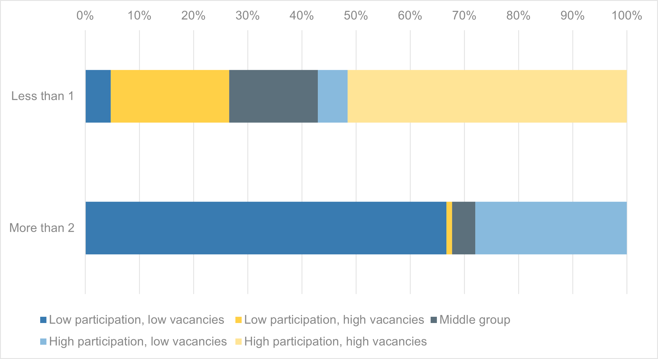
Figure 5 below shows for these local areas – with fewer than one or more than two unemployed people per vacancy – the proportion of local authorities that are in each of the five groups set out in section 2 above (i.e. areas with high/ low/ middle participation and vacancies). This shows, perhaps unsurprisingly, that:
- just over half of those areas with more vacancies than unemployed people have high labour market participation already, while around a quarter are areas with low participation and so where there should be more scope to increase economic activity
- those areas with at least twice as many unemployed as there are vacancies are overwhelmingly places that already have low participation overall (two thirds of the total), although nearly 30 per cent have high labour market participation (and are particularly in London).
However a key finding in the graph below is that within each of these two categories, four or five of the broad participation/ vacancy groups are represented – illustrating again that even ostensibly similar areas face different needs and challenges.
Differences within and between areas
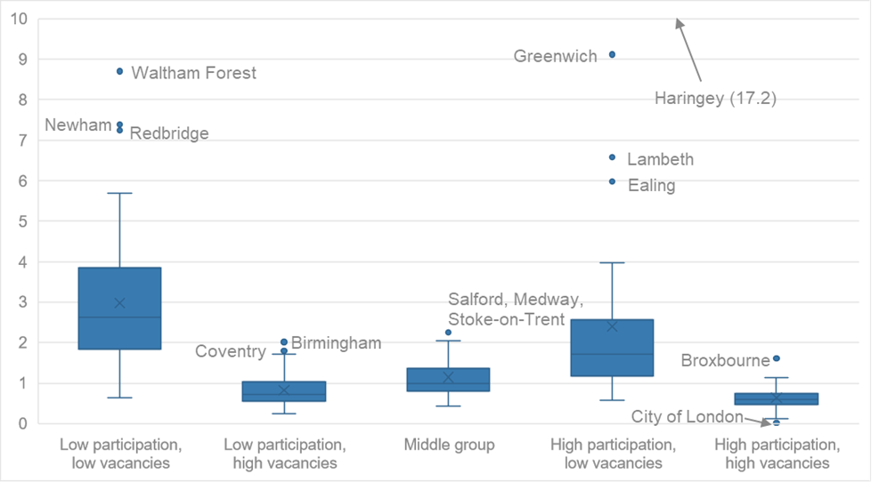
Another way to illustrate that there are variations between areas is by using a box plot. This shows the distribution of results around the median average figure – with the ‘box’ itself representing the range within which half of all data points fall (so the range between the lower and upper quartile) and the highest and lowest figures represented by ‘whiskers’ above and below the box (with the whiskers capped at 1.5 times the size of the box).
Figure 6 below illustrates this for all areas’ unemployment:vacancy ratios, and shows that half of areas have between 0.7 and 2.3 unemployed people per vacancy, with a median figure of 1.2. This means that in half of all areas, there are either more than 2.5 or fewer than 0.7 unemployed people per vacancy. This box plot also excludes outlier areas which would be beyond the ‘whiskers’, which in this case would mean those areas where the number of unemployed people per vacancy is more than around 4.5. In all there are 20 outlier areas, predominantly London boroughs but also including South Tyneside, Tameside, Hastings, Blackpool, Thanet, Bolsover, Redcar and Cleveland and Hartlepool.
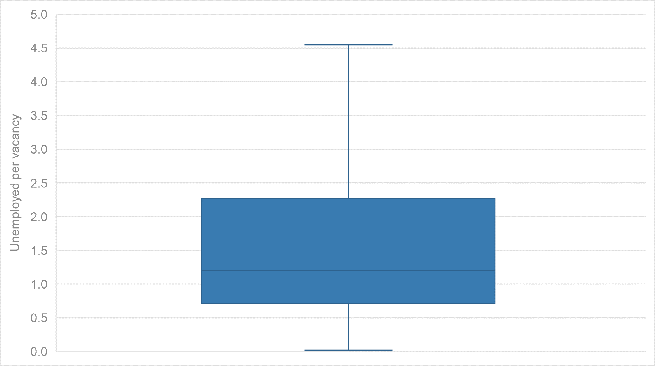
Source: IES analysis of Annual Population Survey and Adzuna data
Figure 7 below then shows box plots for each of the five ‘groups’ of local authorities. Unsurprisingly, this shows in particular that the medians and ranges are far greater for areas with low vacancies (the first and the fourth box plots), with areas that also have low participation faring worst. Areas with higher vacancies inevitably also have far tighter labour markets, with areas with high participation being tightest (and likely less able to further increase supply in order to meet these labour shortages).
This graph includes outliers, and illustrates that most of these are within London (with Haringey being off the chart); but that some are also in other urban metropolitan areas with relatively high vacancies but also average or below-average participation – and so where there should be greater scope to raise employment.
It should be noted that London overall is unusual, as it encompasses many boroughs with very high unemployed-vacancy ratios but also Westminster and the City of London where ratios are exceptionally low and vacancies very high. So while London overall is weaker than average on unemployment per vacancy, the challenges for many London boroughs are more around access to jobs elsewhere in the capital than (just) job creation within local areas.
Source: IES analysis of Annual Population Survey and Adzuna data
How different areas fare on wider economic indicators
This final section compares the five broad types of areas – i.e. grouped on participation and vacancy rates – on different economic and labour market indicators. This analysis illustrates again that areas have often significantly different circumstances and challenges, and looking ahead may face starkly different prospects from future economic and labour market changes.
Employment and earnings
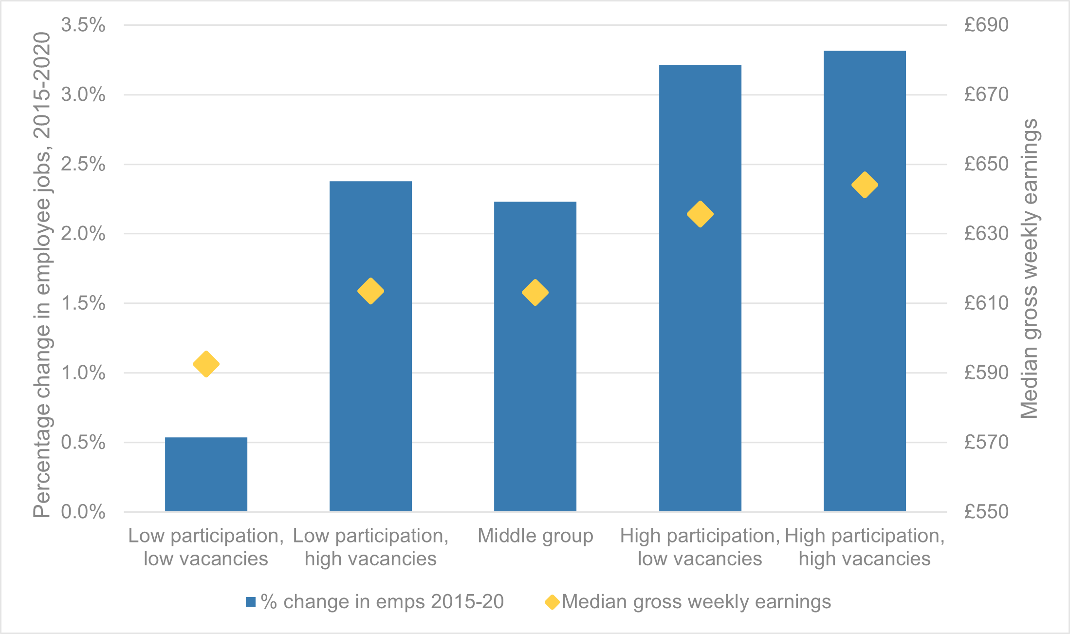
Using ONS Business Register and Employment Survey data, we can map employee jobs by place of work (rather than residence) in order to identify any differences in jobs growth between areas in the five groups. This shows that areas with low participation and currently low vacancies have seen virtually no employee jobs growth in the five years leading up to the pandemic. Areas with high economic activity on average saw just over 3 per cent employee jobs growth. Areas with lower participation but high vacancies are likely to be better placed to start to close the gap in the coming years.
Analysis of Annual Survey of Hours and Earnings data also finds a clear correlation between earnings and group membership, with low participation associated with lower earnings and higher participation associated with higher pay. Pay is highest in areas with high vacancies and high participation, and lowest in places with low vacancies and participation.
Figure 8 below shows both employee jobs growth (blue bars, left hand scale) and average earnings (yellow diamonds, right hand scale).
Source: IES analysis of Annual Population Survey, Adzuna, Business Register and Employment Survey and Annual Survey of Hours and Earnings data
Qualification levels
There is also a clear fit between qualifications profile and group membership. Areas with lower participation and low vacancies have fewer residents with higher qualifications (36 per cent compared with at least 40 per cent in other areas) but also higher rates of people with no qualifications, especially when compared with areas with high participation (around 14 per cent compared with around 10 per cent). This points to the challenges that many areas face both in improving skills but also retaining those with higher qualifications.
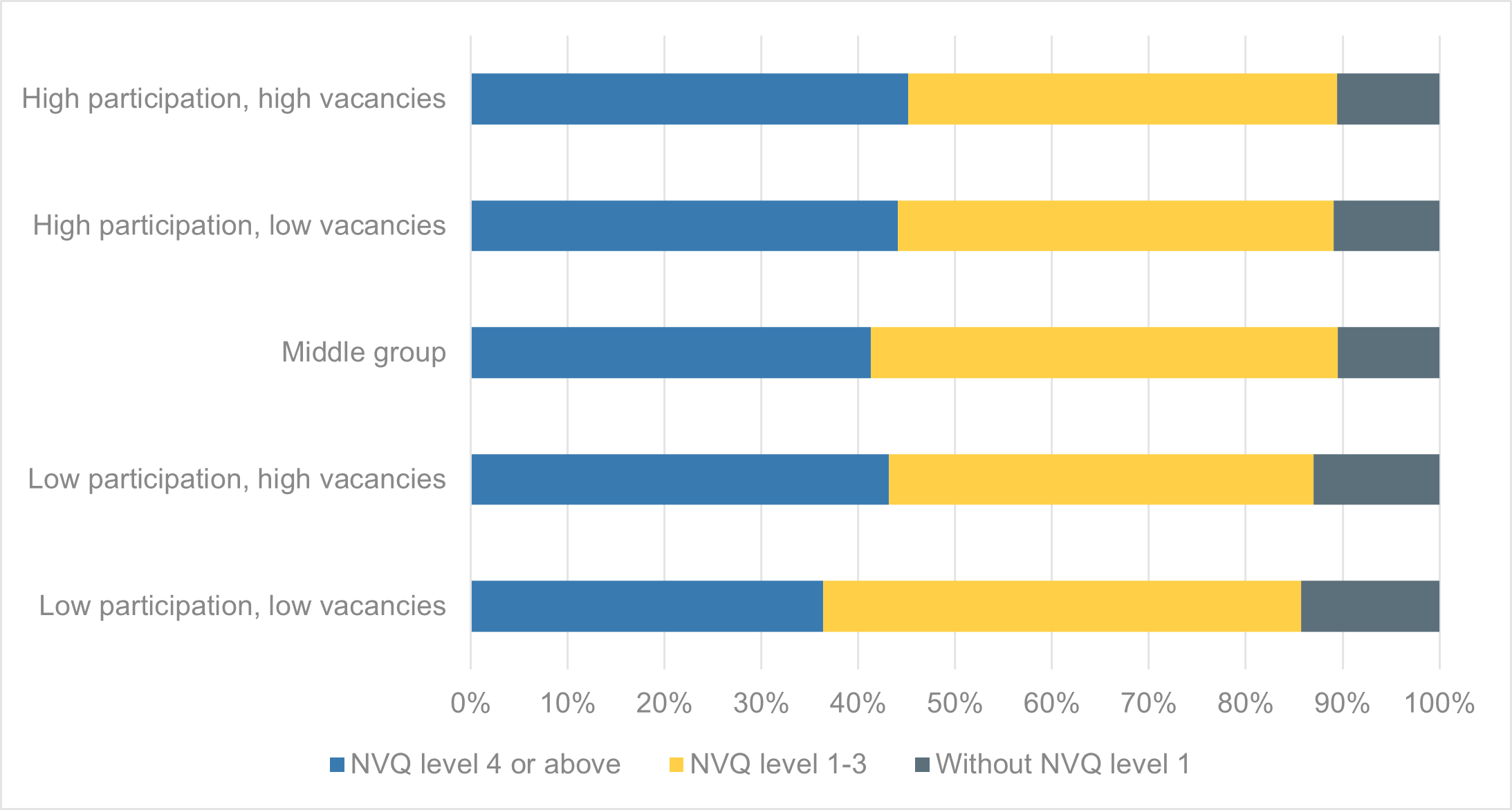
Source: IES analysis of Annual Population Survey and Adzuna data
Industries and occupations
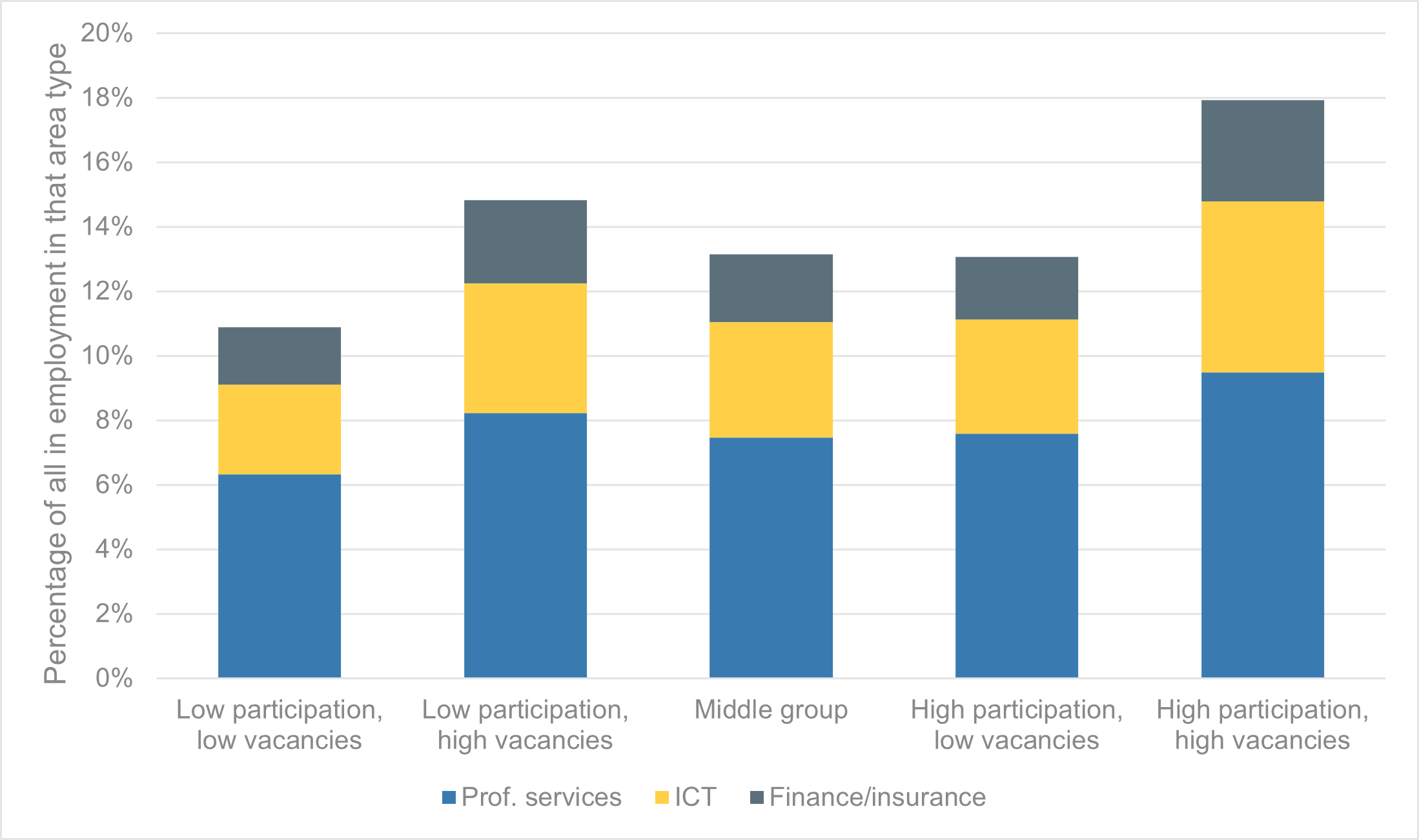
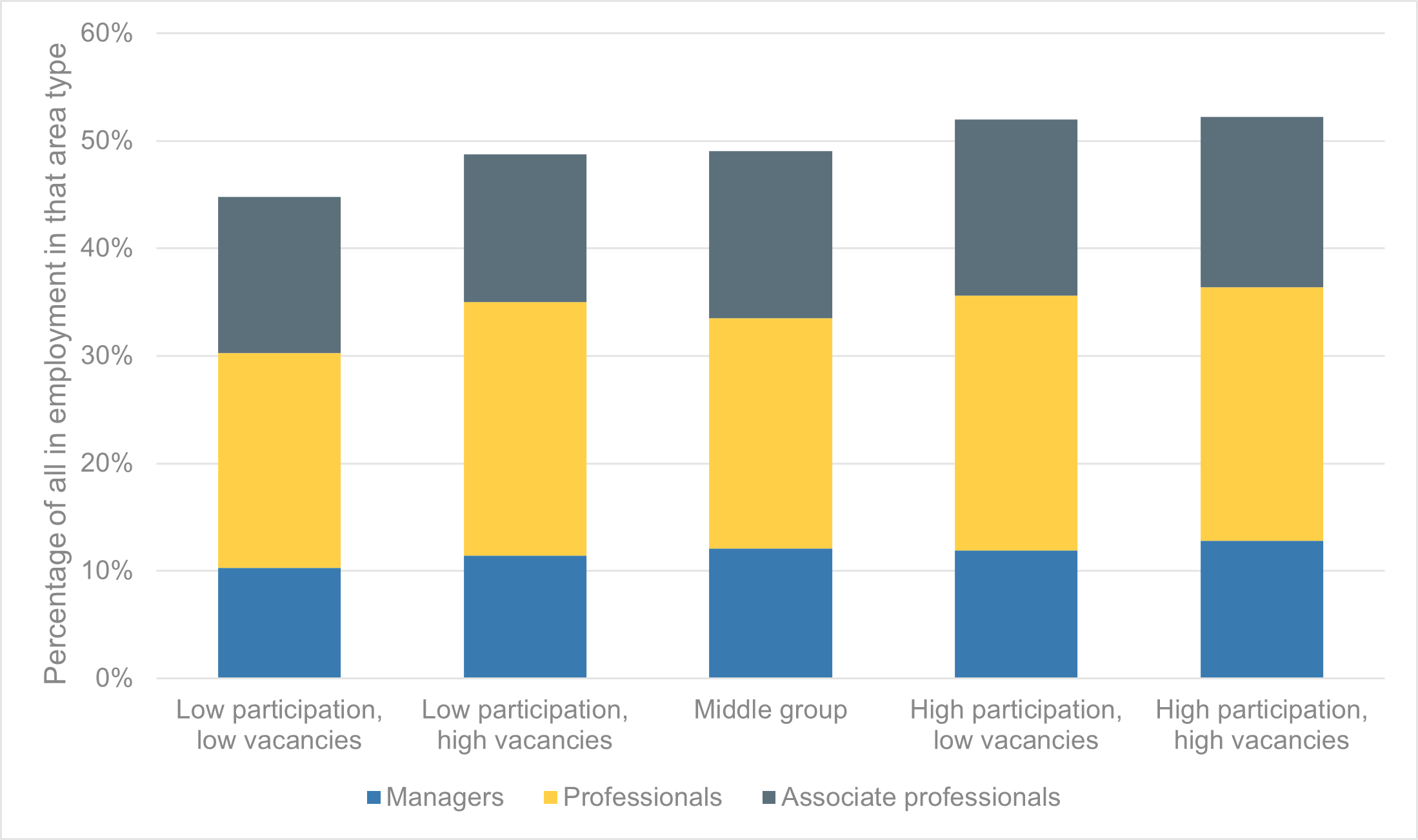
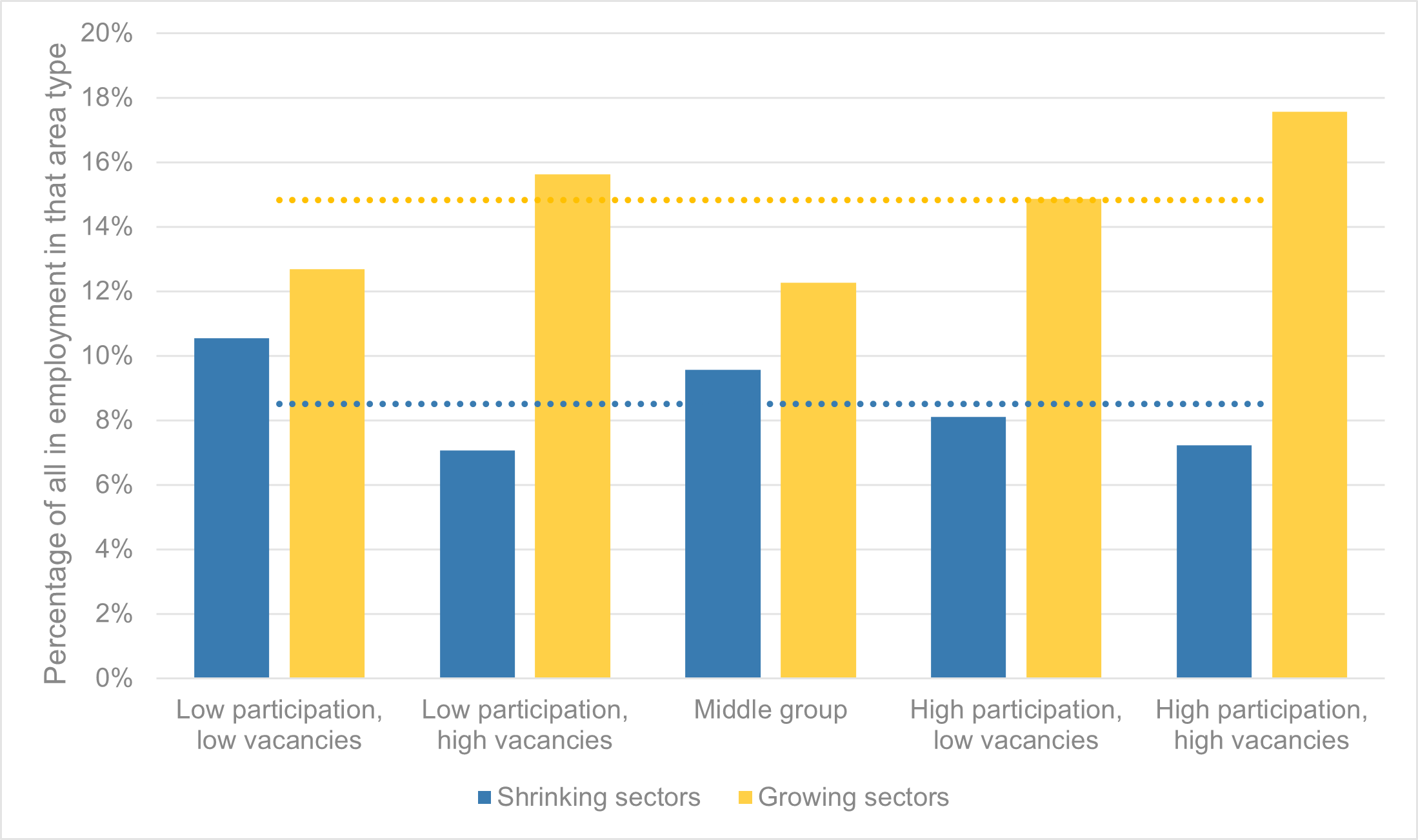
Perhaps unsurprisingly given this picture on employment growth, earnings and qualifications, areas with higher participation and vacancy rates also have substantially more people working in high value-added sectors (nearly one in five) and in higher level occupations (just over half). Areas with low participation and low vacancies perform weakest both on high-value sectors and high level occupations.
Interestingly, areas with low economic activity but high vacancies perform relatively well on high value-added sectors, which likely reflects that this group includes a number of cities with relatively strong (commuter) economies but also low (resident) employment rates, i.e. Birmingham, Bristol, Coventry, Leicester, Liverpool, Manchester, Oxford, Sheffield and Westminster).
Source: IES analysis of Annual Population Survey and Adzuna data
Source: IES analysis of Annual Population Survey and Adzuna data
Future opportunities and risks
Finally, analysis of Working Futures data illustrates that areas with low participation and low vacancies are at far greater risk of industrial decline in future, while areas with high participation and vacancies are relatively better set for future growth. This is illustrated in Figure 12 below, which uses Working Futures 2017-27 employment projections to identify those sectors forecast to experience the largest percentage decreases and increases in employment – with the former group comprising agriculture, mining and manufacturing; and the latter group comprising IT, professional services and arts and entertainment.
Overall, around one in nine of those living in areas with low participation and low vacancies work in industries at risk of decline, compared with just one in fourteen of those who live in areas with high participation and high vacancies. Meanwhile one in six of those in the latter areas work in industries likely to grow in the coming years, compared with just one in eight of those in weaker areas.
This suggests that if these disparities are not addressed, then we will likely see inequalities between areas continuing to widen in the years ahead, undermining efforts to level up opportunities between places.
Source: IES analysis of Annual Population Survey, Adzuna and Working Futures data
Conclusions
The UK economy and labour market is changing at a rapid pace – reflecting a range of demographic, technological and societal factors; alongside the disruptive impacts of the COVID-19 pandemic and our exit from the European Union. However the analysis in this report shows that these changes are not being felt equally across the country. For example even as vacancies hit record levels, in one third of the country there are still more than twice as many jobseekers as there are job openings, leaving residents at risk of long-term unemployment and poverty. However, at the same time in two fifths of areas there are now more vacancies than there are unemployed – making it even harder for employers to fill jobs, holding back growth, and potentially contributing to even higher inflation.
Our analysis shows, however, that differences between areas are even more nuanced and complex. By categorising places according to their rates of labour force participation and of vacancies, we find a diversity of experiences across the country. However there are also some common themes and patterns – with for example many coastal and ex-industrial areas facing lower participation and fewer vacancies, many towns and cities with strong demand but relatively low participation, and more prosperous areas enjoying both high participation and high vacancies. These differences reflect different local economies, local needs, workforce skills and industrial bases. And looking ahead, areas that have historically been more disadvantaged appear to be at greater risk of falling further behind, while areas with stronger economies appear to be better set to benefit from future growth.
So just as a ‘one size fits all’ approach will not work in meeting these challenges; neither would a two, three, four or even five sized model. Public policy and services to be able to understand and respond differently to the needs of local business, residents and communities.
[1] Using Annual Population Survey estimates of the proportion of the 16-64 year old population in each local authority that is ‘economically active’, and so either in work or actively seeking and available for work.
[2] Adzuna data has been apportioned to local authority level based on geography data supplied by Adzuna, and then presented as a ‘vacancy rate’ showing the number of job vacancies per hundred people aged 16-64.
[3] Local unemployment has been modelled by apportioning the national Labour Force Survey estimate for unemployment between local authorities based on their share of the claimant count (which is an administrative measure of those claiming unemployment-related benefits). This approach was taken in preference to using Annual Population Survey estimates of local authority unemployment rates due to the small sample sizes and therefore wide sampling variability in APS estimates of local unemployment.